My Photoshop Work
This here is my Photoshop practice work of using the FX feature. As you can see on the right of the image you can see the FX features I've used on the words. For example the bottom one has a dropped edited shadow with inner glow and pattern text.
This here was the first Photoshop practice work I completed. I used different fonts and had them arranged and angled differently and warped the text to see what warped effects worked and how they looked in the font and color.
The top one dose not work as the font and color is to thin and the warped text makes it harder to see, whereas the middle one and one on the side is good and works as the warp is clear to see and works with the color and font.
This Photoshop task had me work with the pen tool to create lines around and join them together creating a wave. From this I was able to type across the wave adding a wave effect to my text. positive creating wave effects and having text around images is a good tool to have its seen common on certain posters.
Negative was that it took me a while to figure out how to create the lines and the technique in making the wave effect.
This Photoshop feature is feathering. Supposed to create a fading effect around an image. It easy to do and you get this by selecting parts of an image and clicking the feathering option above and picking the amount of pixels you wont faded.

This Photoshop task is a combined edit of all methods of FX features and warped text.

I did this effect by finding a image of an mountain and typing out a word onto a layer. I then placed the picture layer on top of the word layer and clicked alt between the layers creating this affect. I then copied the process for the bottom word put added a warped effect onto it.

My First Attempt of a Thumbnail Magazine Work

My Movie Magazine- created using Adobe InDesign (DTP)

This is the front page of the magazine that I am creating on Indesign. I used a structure to show were each place of an image, text or masthead would go.
The images are movie related with 1917 (war film) Inception banner (2010 sci-fi mystery movie) and new upcoming top gun maverick. The text is a description of the plot and on the other side and quoted interview from Graham Norton.

Studio light image selfie that I took in my house as I wanted to capture the lighting behind me

Contour light image portrait I set up in-front of a wall to focus shots on me

Natural light image selfie as I wanted to see and edit natural light photo.

Green Screen photo taken for the magazine to edit myself into it


Photos to be used in the magazine. These were used for specific stories.

Double page spread of my magazine

This feature is called brushes and text over image. In photoshop save an image of an face from the internet as an asset and save as a PNG. You place the image and free transform it. use the magic wand to select the area and creates text speech to paint over the area.
In-Design Task Year 12


This is my copy from the brief of today formative assessment. The brief instructed we try to copy the source as much as possible. I firstly uploaded some images from a share folder and got an example magazine to copy and compare to.
Some of the tools I used from the selection and drawing tabs. Selection tools mostly helped on margins and to alike things up so it all looked neat. Drawing tools helped with creating text boxes and lines to create parts of the magazine.
I used Century and sans serif fonts on the magazine for headings and mastheads. I did change some images and headings of stories to have a difference between the source but keep moist things the same. I struggled to read the top left heading by the date so had to use my own innovative. I was also able to copy the title of them magazine to the same font size and font.
Updated Version of my Chronicle Project Magazine using InDesign
This is a progress of amends I've been told to work on by my teacher. This entails getting the correct amount of work lines and titles being the exact same font and size
First image some amends have been made. Need to look at grid lines and add the gaps between the text boxes and fix the text boxes. Also need to fix the font of the sub head line.
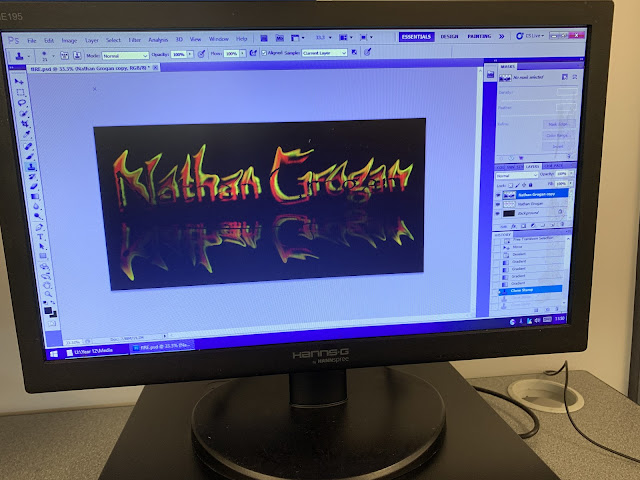
FIRE TEXT PHOTOSHOP
I created this during pre-production projects
To create this I had to have a 3 rasterized copies of my name (Nathan Grogan) but in 3 different colours. Red, orange, yellow. The idea is to merge all three colours together, liquify and blend them in and warp the text.
This creates the effect of a free flowing flame over the text and that the flame is moving. Then you create a mirrored faded version so show and effect of reflection of the flame but copying the text again. Finally you drop in a black background to capture the effect.
InDESIGN CHALLENGE TASK 5
This is 2 versions of my formative Task 5 work. One weight he grid lines it show margins and and columns and the other one being without. Some images I was able to edit and adapt into the magazine and some like the main image needed editing through photoshop using the magic wand tool. The magic wand tool made everything around the image a white background without damaging it. This also made it blend better to the magazine.
The top anchorage I cropped out of an image already used through photoshop. All of details were created through Indesign. All text boxes were created to represent the side text and main text stories. All images that went with text were sourced of the internet and turned into PNGs to make it formatted. Although the text and some parts of it are missing from the brief this is what I was able ti complete during the time I given.
Ice Cold Photoshop
I created this in pre-production projects.
To create this I had to find a chunky font and duplicate a layer 4 times using the same font and text but in a different colour. I then had to rasterize the layer and merge all 4 layers together. Once I did this I liquefied the layers to merge and create a Ice look to the text. I then used another filter which is called plastic wrap which gave it a glowing, shiny look to the font. I then duplicated the merge layer and f added a gradient and skew effect to create a reflection. The last effect I added was a lens flare which added a light source into the image.
Morphing with a Clone Tool
I created this in pre-production projects.
This is a morph edit. This is created by having 2 layers both with different images. You select around a certain part of the image and save the selection. By saving the selection you can paste it into the selection and create the effect. On this edit I used 2 more layers for the blood splatter and the eyes. The images here is Actress Sigourney Weaver and alien designs from the original 1979 movie.
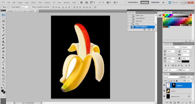
Banana Split Photoshop
I created this in pre-production projects.
This is a morph edit. This is created by having 2 layers both with different images. You select around a certain part of the image and save the selection. By saving the selection you can paste it into the selection and create the effect.
Eye Bullseye Photoshop
I created this in pre-production projects.
This is a morph edit. This is created by having 2 layers both with different images. You select around a certain part of the image and save the selection. By saving the selection you can paste it into the selection and create the effect. This one was my own idea though so the target in the middle of eye ball


